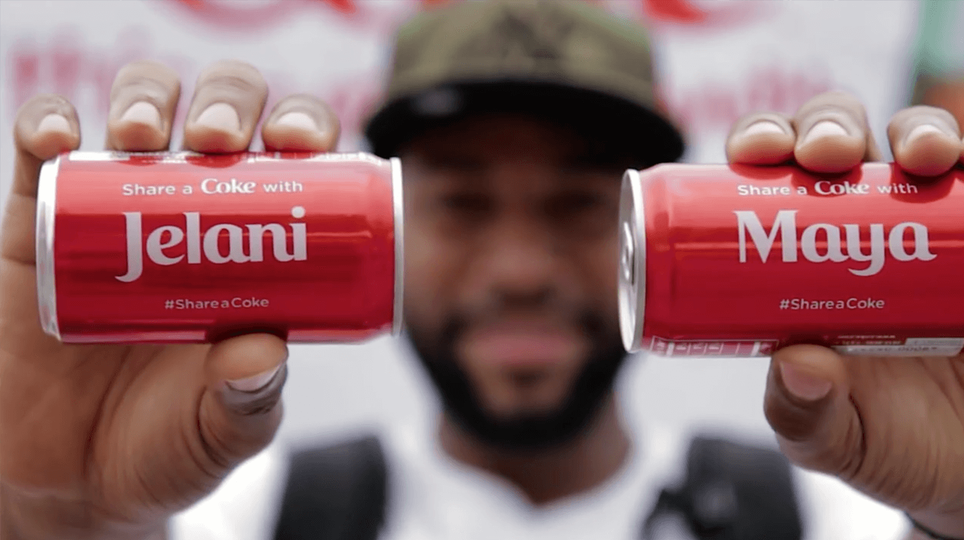
Only 1,157,802 cans to go…
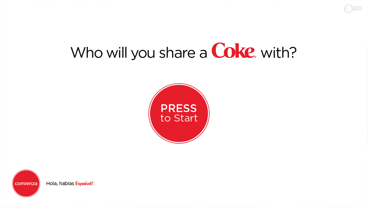
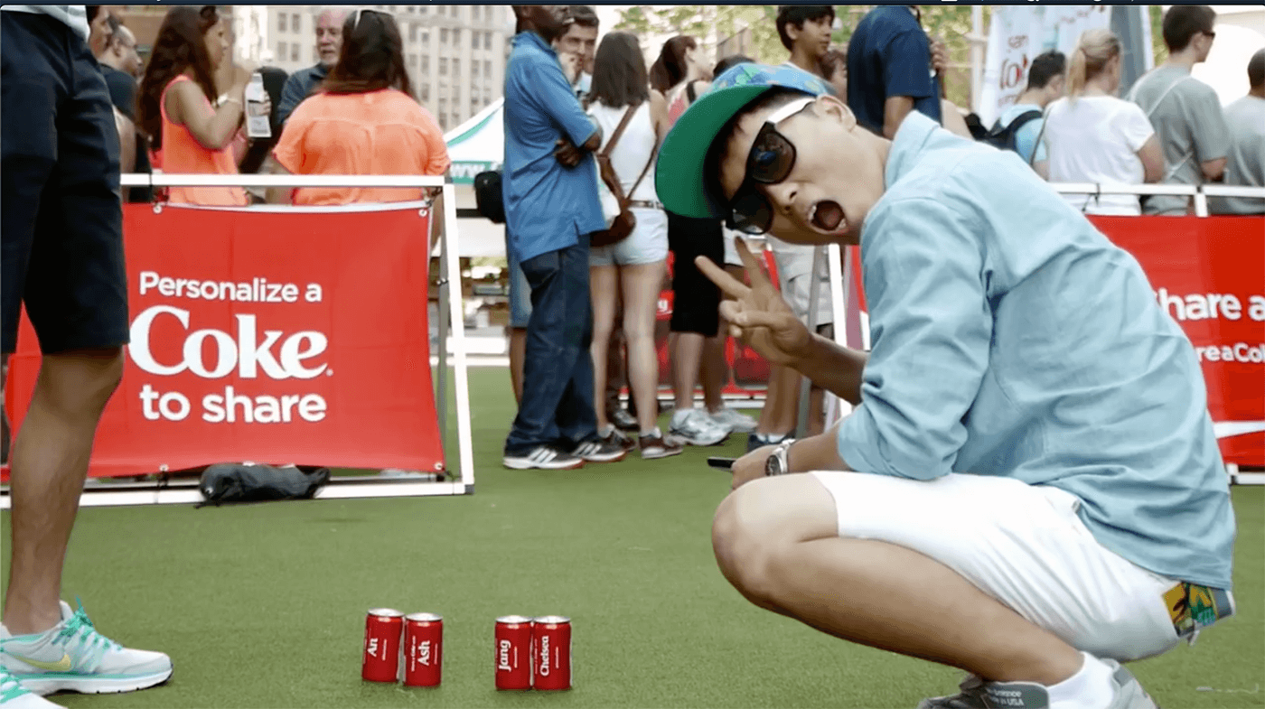
Yep, it’s hard to believe how many individualized name cans we made. Keep in mind, each event guest, not the staff, interacts with our touch-screen vending machine-style kiosk – this covers the most diverse range of people the US has to offer. If the interface looks simple, that’s the idea! Eventgoers may wait 40min in line to get their can, so every element of the UX design has been scrutinized and streamlined to keep that line moving.
Since every moment of second-guessing or searching on screen adds to the queue of people waiting, the goal was to create an interface with clarity and intuitiveness above all. Ruthlessly streamlined – an excellent challenge to solve!
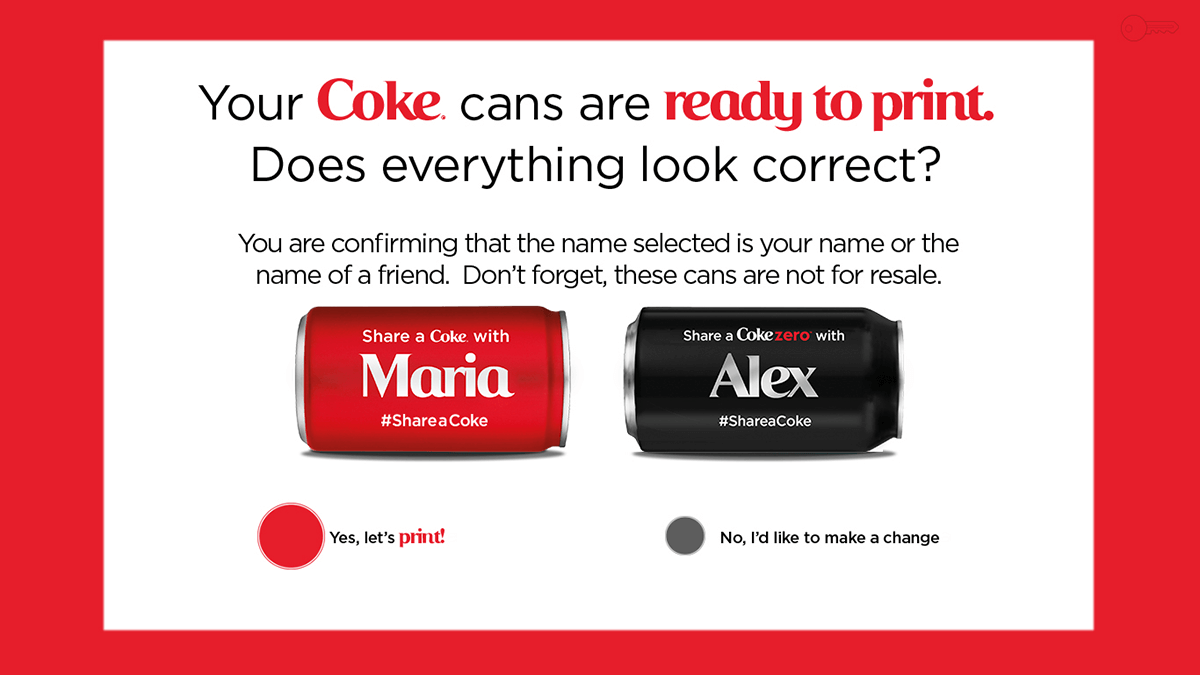
User flow
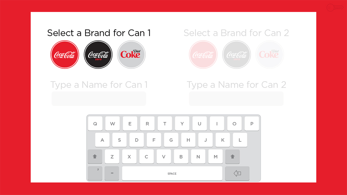
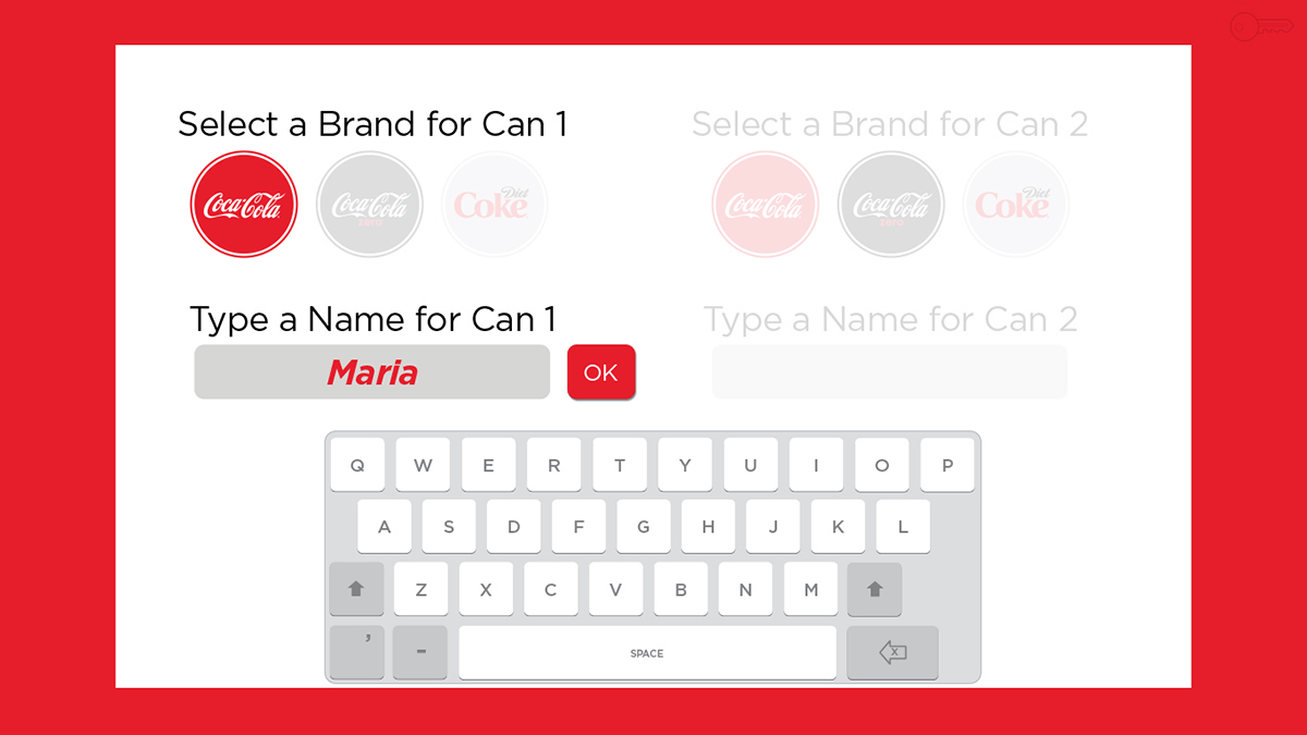
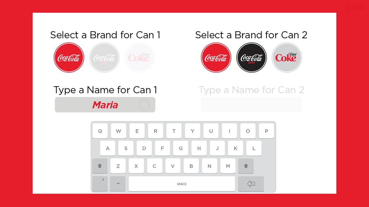
Guests would first select their drink between Coke, Diet Coke, and Coke Zero. Once selected, the next entry field is unlocked to add a name, select a can for a friend, and add their name. All gated fields are visible, letting users see the steps ahead for clarity and context.
But my parents named me Dorkbot, I swear…
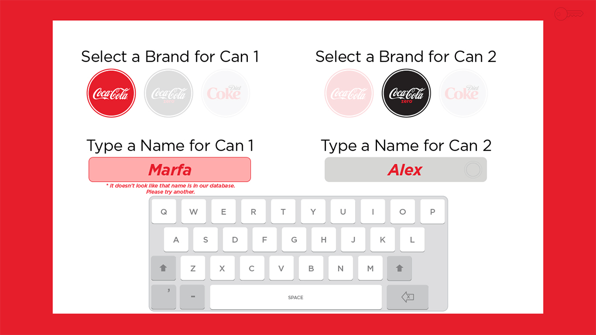
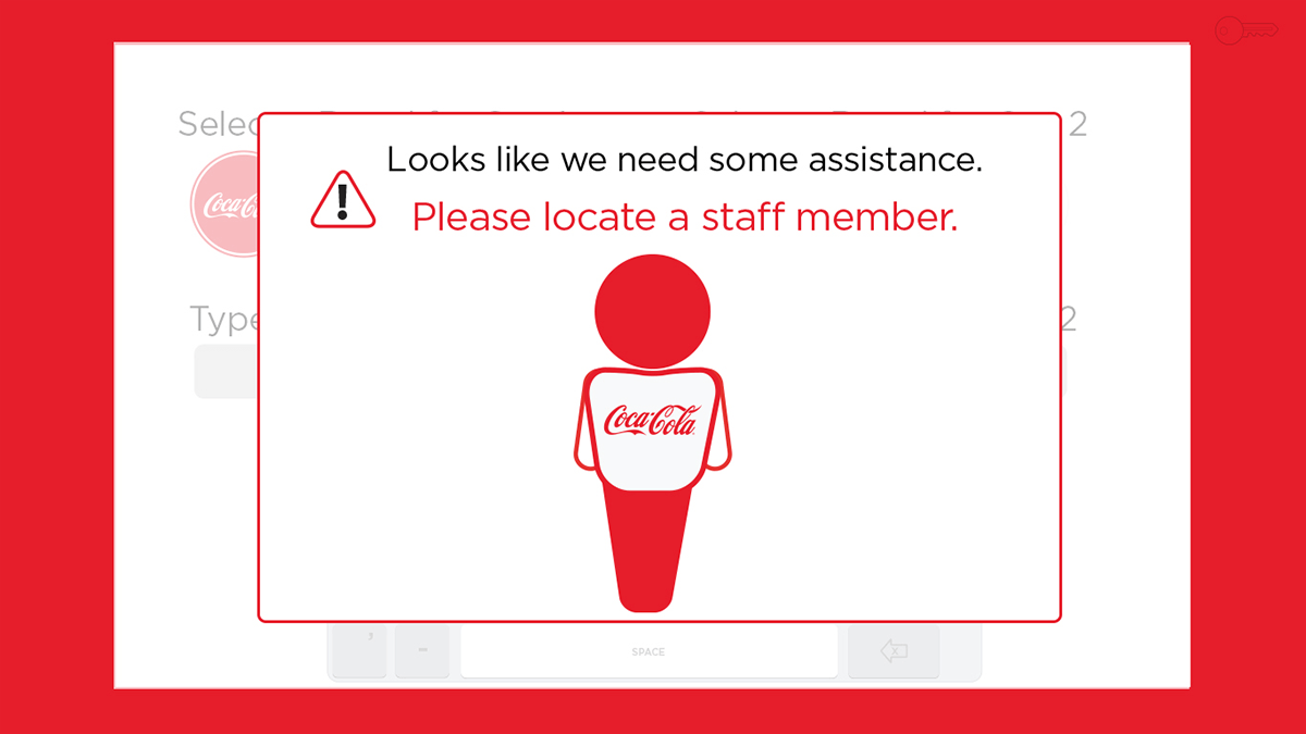
If a name is entered that isn’t in our database, or an unapproved word (use your imagination!) is attempted, guests are politely steered to safe territory up to 3 times before a Brand Ambassador is notified to assist.
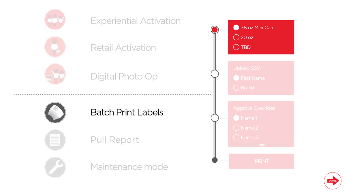
So, what’s behind the curtain?
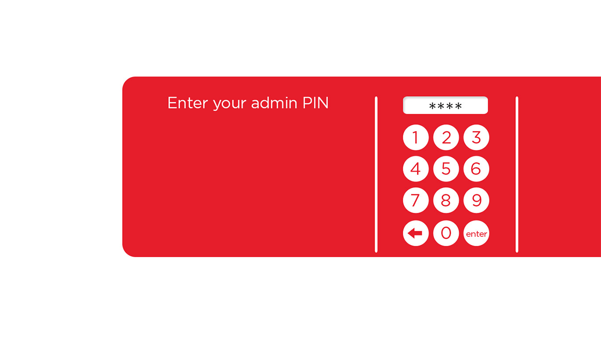
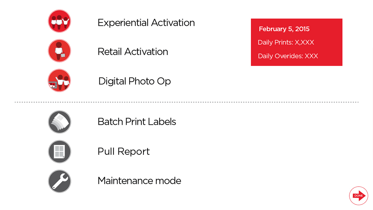
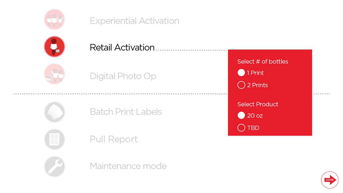
With a brand like Coca-Cola, there should be no “behind the curtain.” So even the admin interface has been styled to brand guidelines and given the same attention to detail as guest-facing ones.
See it in action!
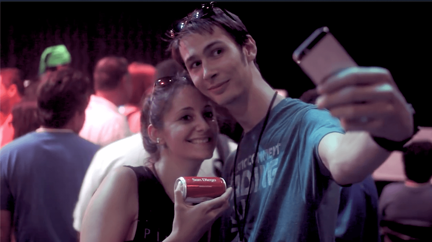
One improvement of the second year is that we were able to add a substantial number of names to our database, allowing a far more diverse and inclusive range of cans to be personalized without seeking assistance from staff.
(Additional team credit: CW: M. Lee, GCD: K Gosselin, Production: Momentum)
